Mikołów City
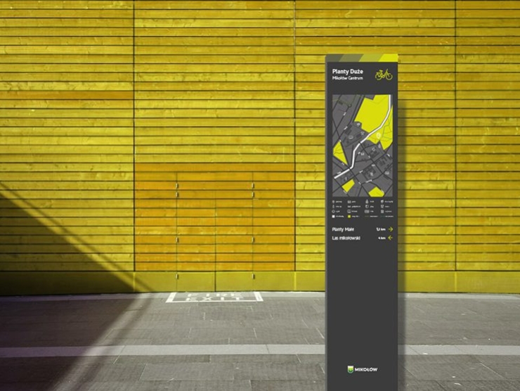
The new City Information System project draws inspiration from the existing Mikołów city logo. To ensure a consistent city image, the color scheme of the new system is based on the shades of the city’s emblem, with each color assigned a specific function related to the city’s division according to certain principles.
The new project blends tradition with modernity, ensuring that Mikołów maintains its image as a city that is continuously evolving.
Design: musk kolektyw
Client: Gmina Mikołów
Location: Mikołów
Project: November 2019 – April 2020

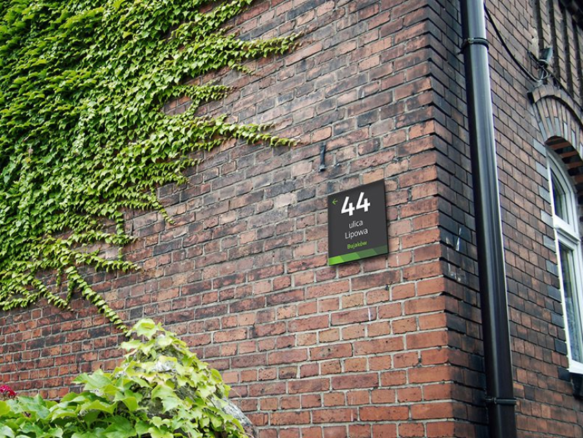
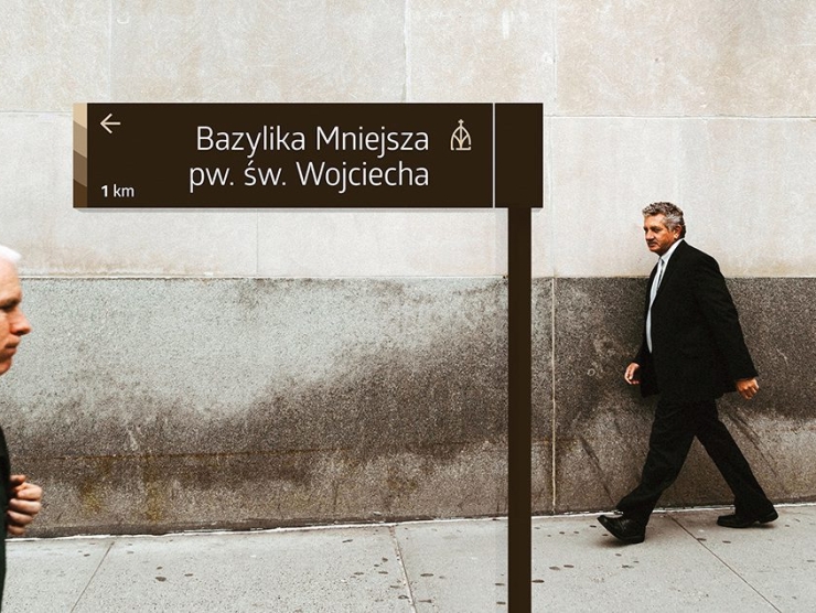
The new City Information System serves users in several ways:
– it provides information on locations,
– it guides users to major landmarks,
– it maps out routes for walking or cycling,
– it informs about the rules and regulations for using facilities,
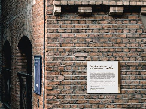
– it conveys historical knowledge about the city.
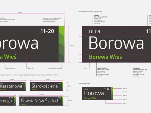
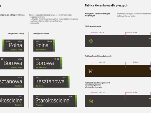
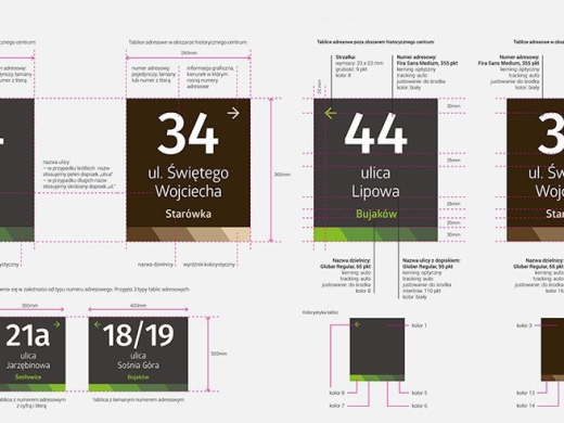
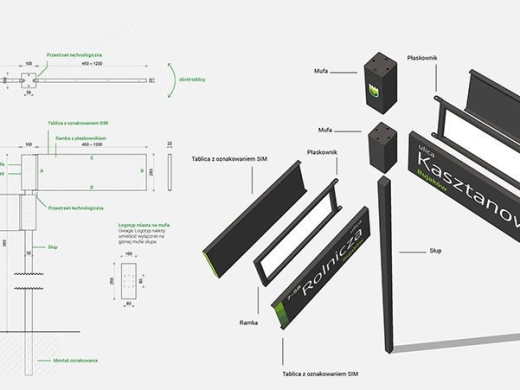

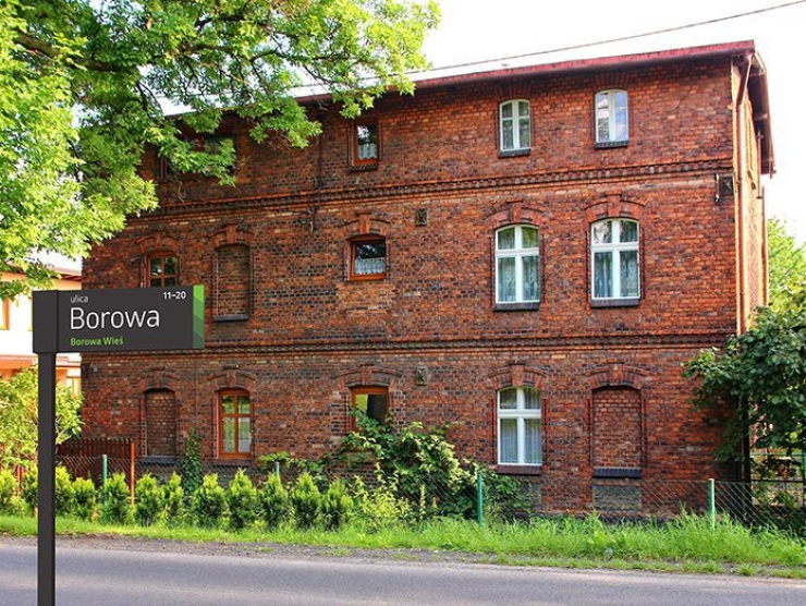
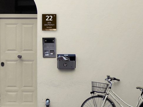
The signs indicating street names and addresses are divided according to their location. Signs in the city center, in a brown color, highlight the historical character of the area. In contrast, street names outside the city center are set against an anthracite background, inspired by the Mikołów city emblem. To aid navigation, signs for drivers are placed against a light gray background.
Address signs include an arrow next to the number, indicating whether the numbering of adjacent properties is increasing or decreasing. Street signs show the range of property numbers and the direction in which the numbering increases, making it easier to navigate and move around the area.
