Gmina Kościelisko
Our design process for the Kościelisko Municipality began with an official competition, where we set the path for the new communication strategy. We drew inspiration from the region’s abundant folk art, traditions, and deep connection to heritage, focusing on the people who embody these values. These figures include the highlander, the civil servant, the local librarian, the dancer from Dzianisz, and of course, us – the tourists who flock here each season. Together with the unique location and natural beauty, these people are the heart of what truly defines the Kościelisko brand. Our approach wasn’t just about putting people on paper. The entire brand was crafted to be clear, easy to understand, and most importantly – memorable. We avoided abstract forms and complex references, opting instead for simplicity that stands the test of time.
Design: musk kolektyw
Client: Gmina Kościelisko
Project: January 2018 – February 2020
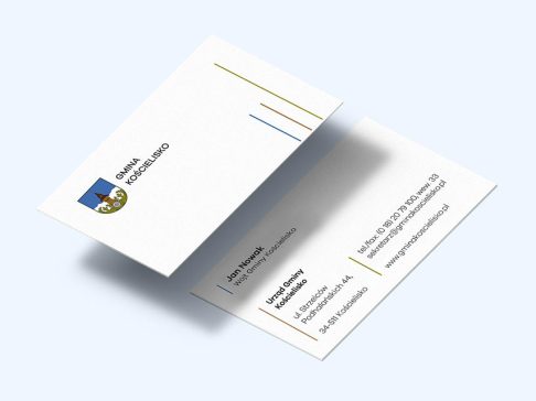
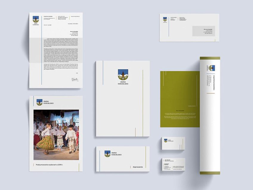
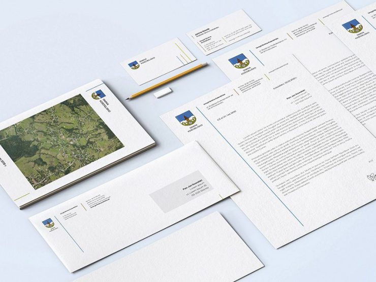
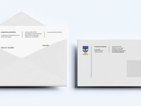
Given the tourist nature of Kościelisko – with its three villages and diverse target audience – we split the graphic communication into two parts: internal (for administrative purposes) and external (for marketing). The internal communication revolves around the municipal coat of arms, which we refreshed to improve its clarity. Subtle graphic adjustments and a refreshed color palette gave it a new lease on life, allowing it to be used flexibly across various media, backgrounds, and sizes. We complemented the updated coat of arms with a new, streamlined visual identity, designed to be versatile enough for everyone – from the mayor to a local firefighter sending an official letter or invitation. This style is simple and linear, using the existing colors of the coat of arms.
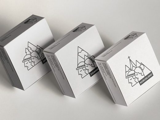
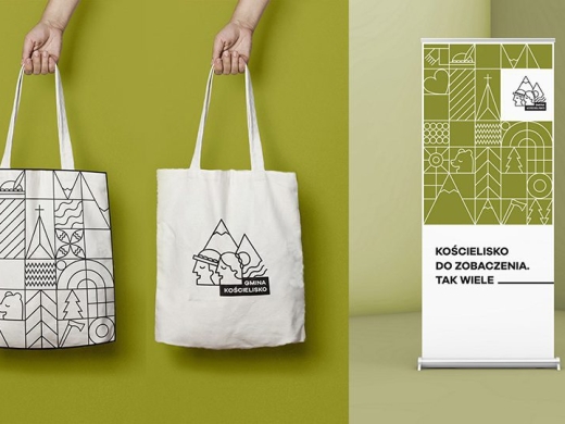
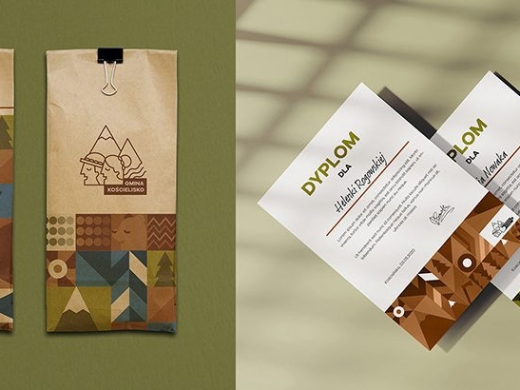
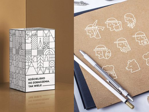
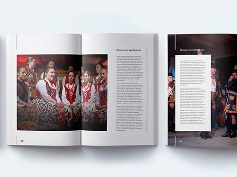
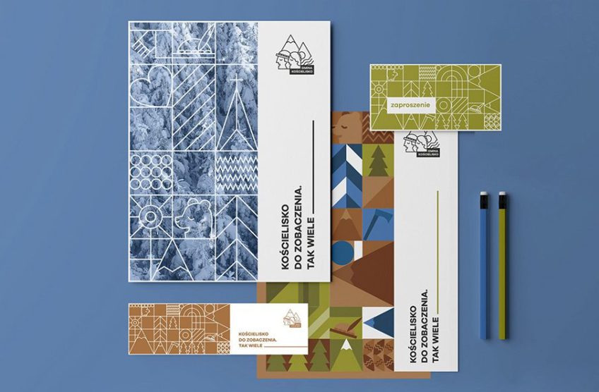
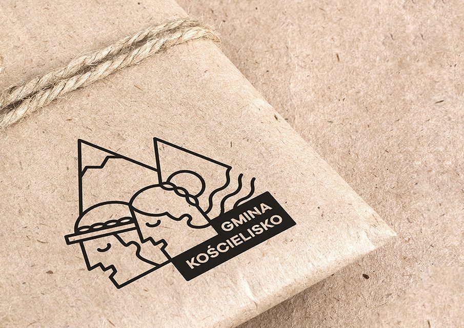
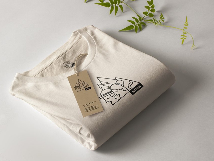
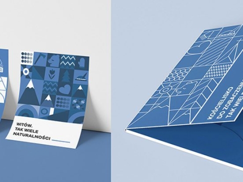
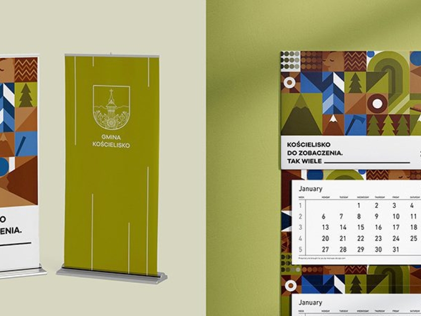
The second part, focused on marketing, features a logo representing the local heroes we mentioned earlier. We intentionally kept it monochromatic to let the audience form their own associations with Kościelisko, guided by the vivid landscapes of the Western Tatras and the rich variety of local flora, fauna, and architecture. The logo is paired with a graphic system that communicates with both locals and tourists in non-official contexts. Though the design is based on a grid, it offers flexibility and a touch of creative freedom, allowing materials to feel less rigid and more dynamic. We didn’t want to confine the Municipality to a static solution that might grow stale over time. That’s why the design includes various styles: illustrative, photographic, and linear, featuring simple drawings of highlander symbols and local delicacies. This approach helped us create a recognizable, strong, and visually distinctive brand that remains adaptable, allowing room for new elements, patterns, and trends to be incorporated as it evolves.
