Elplast
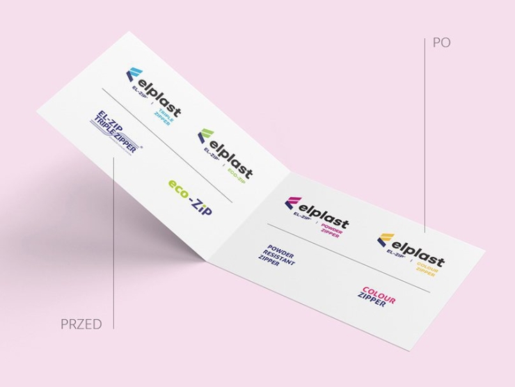
Elplast is the third-largest company in the world specializing in string closures for flexible packaging. It has subsidiaries in Poland, the United States, and China. The previous logo did not align with the company’s dynamic growth, and its adaptations for various product lines had become inconsistent with the original design. Additionally, the use of different fonts in the company name detracted from its recognizability.
Design: musk kolektyw
Client: Elplast
Project: July – December 2016
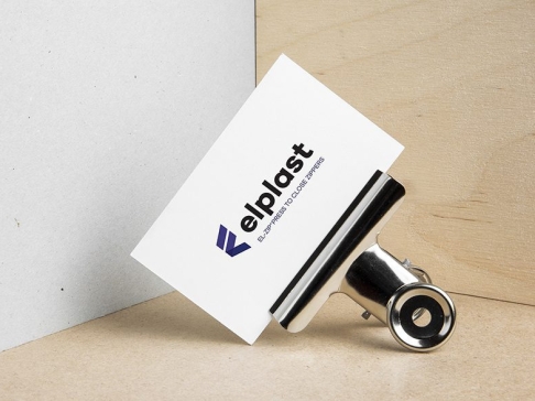
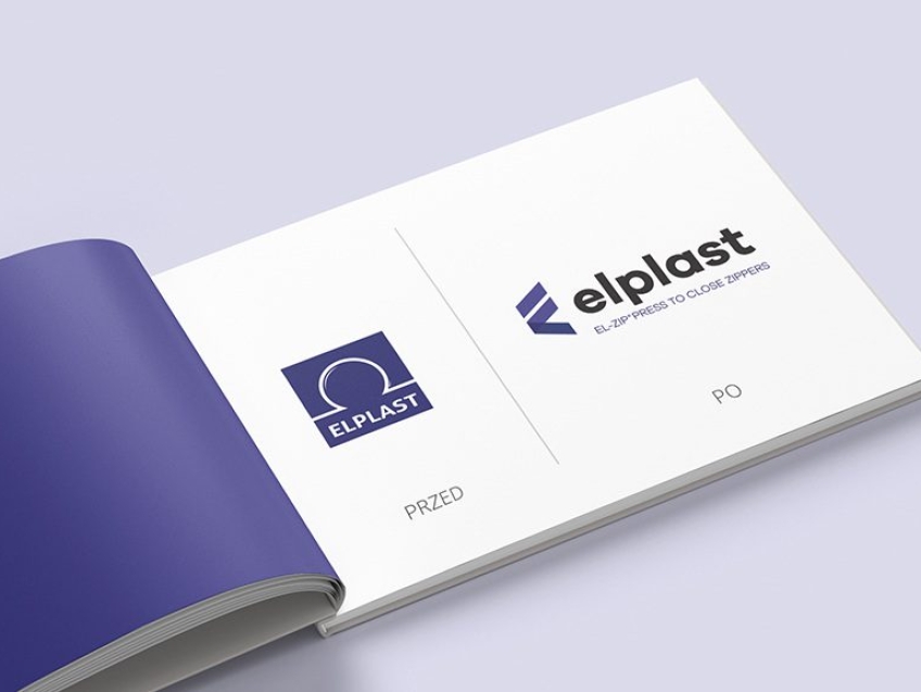
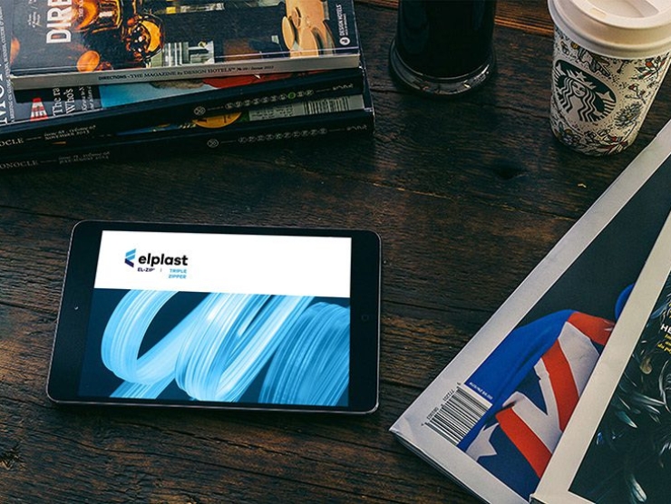
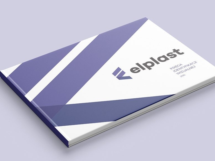
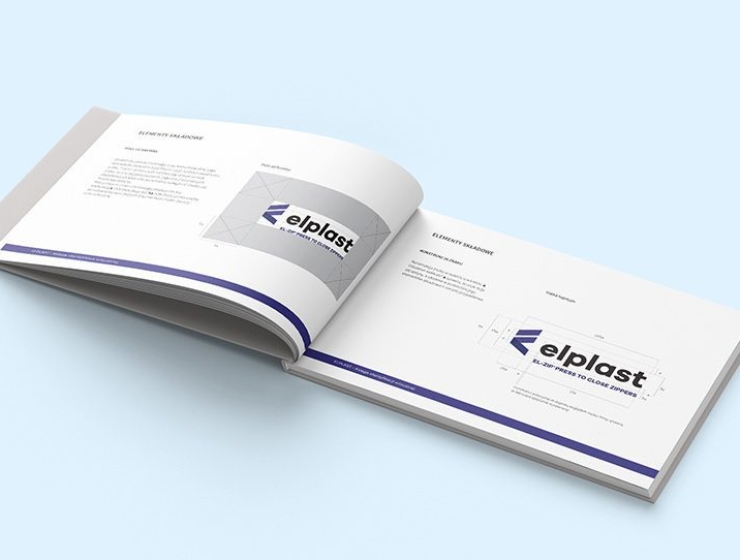
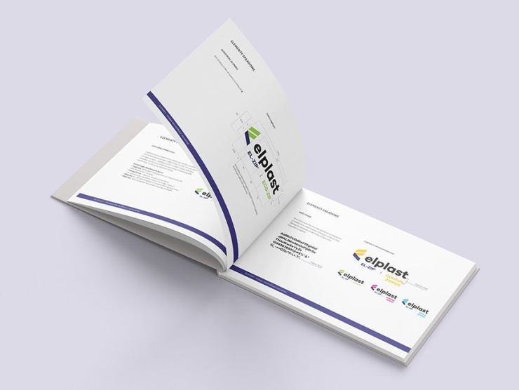
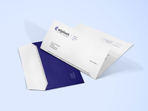
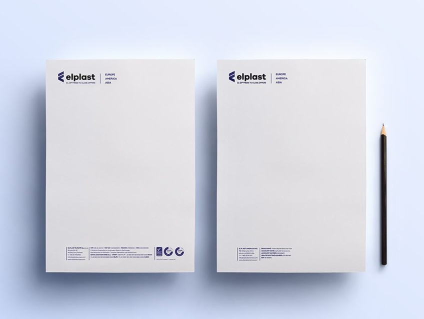
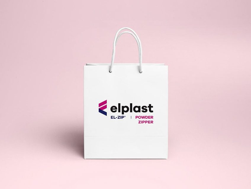
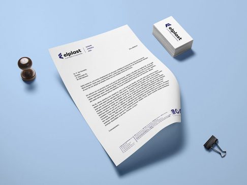
In the rebranding process, we focused on simplifying the logo while maintaining the existing color scheme of Elplast. We used a straightforward, strong font and complemented it with a light yet distinctive symbol that illustrates the company’s activities in a non-literal manner, as per the client’s specifications. The project included creating a brand manual, business stationery, and examples of application in various spaces, including the new company office and new locations abroad.
