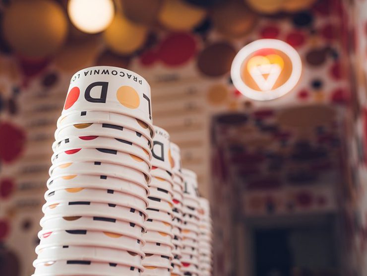
Lodowato in Katowice
Lodowato started the new season with a refreshed interior, which we were asked to design by the owners of the Katowice ice cream parlor. We can say it was ‘neighborly help’ (Lodowato is located 5 minutes from our office). Lodowato has been on the market for several years, and their brand has become recognizable in Silesia due to the high quality of their products and the distinctive visual identity of the company. We wanted the new interior not to be a revolution and to still be associated with the brand, but at the same time to give a breath of freshness, something new and surprising. It sounds a bit contradictory, but designers often have to deal with abstract guidelines.
Design: musk kolektyw
Client: Lodowato
Location: Katowice, ul. Dworcowa
Project: kwiecień – maj 2018
Photos: Radek Kaźmierczak
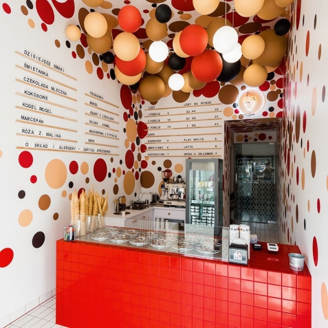
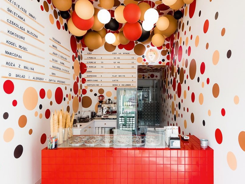
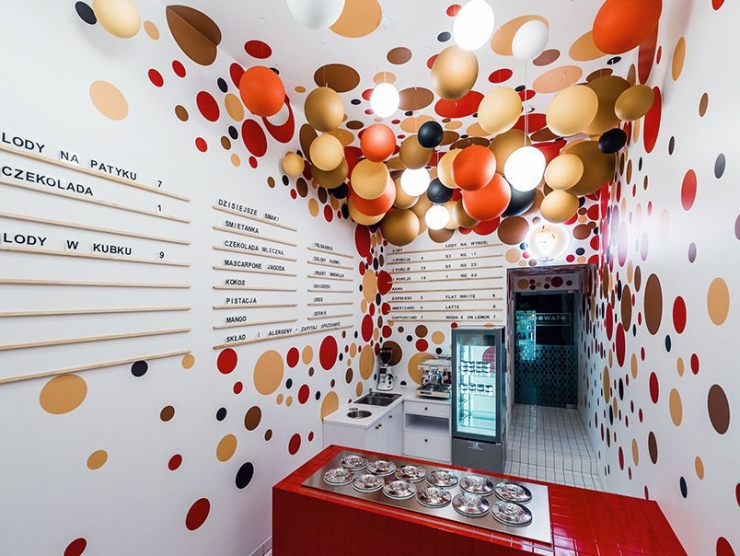
Lodowato presented us with a significant challenge. We developed several concepts, but ultimately returned to the first idea, which the investors eventually decided to implement.
The space was designed to ‘draw’ customers inside—visible from the street level and inviting, yet not overwhelming once inside. To achieve this effect, the main motif became a gradient of spheres in the form of graphics applied to the walls and ceiling—starting with intense colors and many elements in the sales area, transitioning to delicate elements and light colors near the entrance. Additionally, the centerpiece of the entire interior became the freezer display, finished with small red tiles.
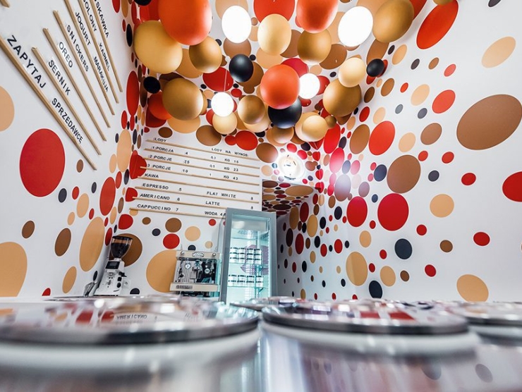
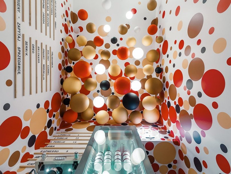
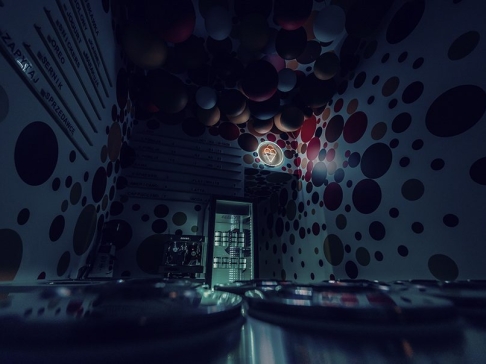
One of the challenges in the design process was the proportions of the space—the ceiling was too high in relation to the square footage. To improve the visual perception, we opted for large-scale decoration, namely an installation of hanging spheres, into which lighting was integrated. Thanks to this solution, the space feels lower and more pleasant. Additionally, we wanted the decor to enhance the experience for people waiting in line, which seems to have worked, judging by the raised heads of customers on opening day.
